Evapotranspiration Prediction Using Light GBM Model: A Comprehensive Guide
A focused review of evapotranspiration modeling using Light GBM, highlighting its accuracy, methodology, and role in modern hydrological prediction systems.
Evaporation and transpiration play critical roles in the water cycle, impacting both agriculture and the environment. Evaporation is the conversion of water covering the soil surface into water vapor, while transpiration is the water loss occurring over the surface of plants.These two processes are commonly referred to simultaneously as evapotranspiration. For instance, through these physical processes, practically half of the water that infiltrates the soil is returned to the atmosphere (Susantha et al., 2022). Based on the relevance of the information presented, Machine learning has become a pivotal tool in predicting evapotranspiration , both in agriculture and water sectors. Using large datasets and complex patterns, machine learning approaches can improve the accuracy of evapotranspiration (useful for irrigational planning and water conservation strategies (Nayak et al., 2024). Many machine learning models are used for prediction of evaporation and transpiration, including linear regression , random forest , support vector regression, and XGBoost. In this study, we want to use light GBM for prediction of evaporation and transpiration. LightGBM is a gradient boosting framework that uses decision trees for regression problems, enhancing speed and efficiency through techniques like gradient-based one-side sampling (GOSS) and exclusive feature bundling (EFB), making it suitable for pricing models of new products (Fan et al., 2019).
Fig. 1. LightGBM model used to predict Evapotranspiration from soil and vegetation water loss.
1. Data Gathering
The dataset includes meteorological and environmental data gathered from April 2002 to December 2020 for Quebec City, Canada. Elements like average temperature (C) and NDVI (normalized difference vegetation index) play a key role in providing in-depth insights into climatic conditions and vegetation health, integral to discussions of ecosystem dynamics.
The precipitation (mm) and evaporation (kg/m2 or mm) columns provide information on water balance and hydrological cycles, which serve studies on water resource management and climatic trends. Furthermore, the root zone soil moisture (kg.m2) and specific humidity (kg.m-1) variables provide essential data for evaluating soil and atmospheric moisture dynamics, which are indispensable for agricultural planning and drought monitoring.
With data spanning multiple years, the inclusion of system:time_start and year enables the exploration of temporal patterns, facilitating analysis of seasonal and interannual variability in environmental conditions. This dataset is critical for evaluating the effects of climate variability on vegetation and water resources, serving as a firm basis for attempts at predictive modeling and sustainable resource management.
2. Light Gradient-Boosting Machine (LightGBM)
LightGBM (Light Gradient Boosting Machine) is a gradient boosting framework developed by Microsoft which uses tree algorithms. It is based on the framework of gradient boosting that trains multiple weak learners sequentially, where each of these learners tries to combine students together to form a super learner.
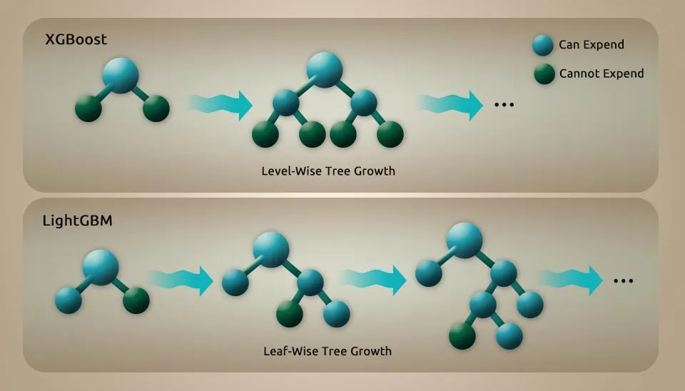
LightGBM is unique by incorporating many key features that enhance its performance with gradient-based one-side sampling (GOSS), exclusive feature bunding (EFB), and histogram-based leaf-wise tree growth in depth limit, etc. GOSS effectively balances sample size and decision tree accuracy by prioritizing impactful data points. EFB optimizes feature processing by bundling mutually exclusive features, which reduces dimensionality and speeds up computation. The histogram-based and leaf-wise growth strategy enhances the accuracy of the model while maintaining computational efficiency.
These improvements enable LightGBM to outpace training time and prediction ability in high-dimensional datasets, making it highly effective for massive datasets.
LightGBM makes use of a decision tree based algorithm which aims to split the feature value for optimization by implementing a histogram based feature. This implies that continuous feature values are divided into numerous small buckets, simplifying the search for the best split. Each of these approaches helps to save storage and computational costs and also makes the algorithm efficient for large-scale datasets. LightGBM reduces the computation cost by dividing feature values into bins and does not sacrifice the accuracy.
LightGBM features a significant advantage. It can deal with missing values well, an important consideration in a lot of data-divin research. Missing data can significantly hamper the analysis after more pre-processing or imputation steps. However, LightGBM inherently takes care of missing values during the training process, which guarantees the robustness of model performance even when datasets are incompatible. This means that LightGBM particularly shines in real world situations where datasets are often not clean, nor complete.
Fig. 2. Level-wise tree growth (XGBoost) compared to the faster Leaf-wise strategy used by LightGBM.
3. Libraries
Numpy is one of the basic packages for numerical computing in Python. It offers support for huge, multidimensional arrays and matrices , as well as a set of mathematical functions to operate on these arrays. Pandas is a robust database manipulation and analytical library providing data structures such as series and data frames, designed to manipulate structured data. Matplotlib is a plotting library that makes it easy for python to create static, animated , and interactive visualizations in python. Scikit-learn provides a wide variety of machine learning algorithms as well as tools for model selection, preprocessing, and evaluation. Use sklearn’ train_test_split as shown below. model_selection is used to partition datasets in training and test subsets, which is one of the most crucial aspects for how we choose machine learning models. It prevents overfitting by testing the model on new data. LaveEncoder is used to encode categorical labels, which is needed because many machine learning algorithms expect input data to be numeric. The sklearn.metrics module offers functions for evaluating machine models using different metrics like accuracy, precision, recall, F1score, etc.
import numpy as np
import pandas as pd
import matplotlib.pyplot as plt
import seaborn as sns
import sklearn
from sklearn.model_selection import train_test_split
from sklearn.preprocessing import LabelEncoder
from sklearn.metrics import *
4. Importing Dataset for Evapotranspiration Modeling with Light GBM
The line this code you provided is used to read an Excel file into a pandas DataFrame.
data=pd.read_excel("/content/ET_WaterLyst.xlsx")
The pd.read_excel function from the Pandas library is specifically designed to read Excel files . the text between the string and the path to the Excel file you want to read. In this case, it appears to be located in a directory named content. This path should be adjusted based on where your file is stored on your local machine or cloud environment.data, the resulting data frame is stored in the variable.
4.1. Dataset Information
Understanding the structure and characteristics of a dataset is essential for effective data analysis. It enables analysts to select relevant data, recognize biases, and uncover intrinsic properties, ultimately facilitating meaningful insights and informed decision-making from complex datasets.
Dimensions of Data Understanding: Establishes the basic principles and context of the data, including its origin and purpose.
Collection and Selection: Involves the methods used to gather data, which can affect its quality and relevance.
Exploration & Discovery: Encourages initial data examination to identify patterns and anomalies, crucial for informed analysis (Holstein et al., 2024).
4.2. Show Dataset Heading Rows
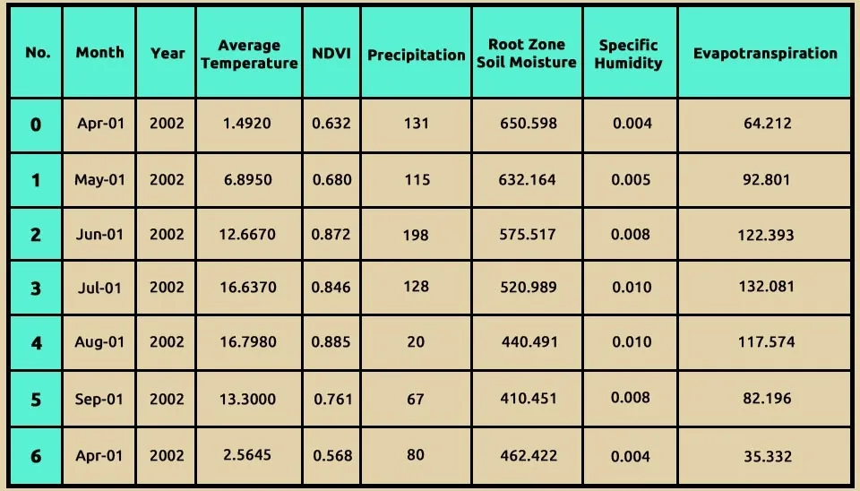
data.head(7) is a general command for the Pandas library of Python, and it has a specific purpose in data analysis.
head(7) function is Pandas Dataframes function that allows you to visualize the first few rows of your dataset. This function comes especially handy, as you can get a brief overview of the data structure and content quickly. The 7argument indicates how many rows are to be shown from the beginning of the DataFrame.
data.head(7)
Table 1. Sample data (seven rows) showing the structure and content of Light GBM's input dataset.
Using data.info() is an important part of exploratory data analysis (EDA). This is helpful to have a quick overview of the structure and quality of your datasets for identifying features or records that require data cleaning or preprocessing to be performed, before proceeding with analysis or modeling. This dataframe has 225 entries (rows) and index goes from 0 to 224. It gives you an idea about the size of your dataset. Moreover, the DataFrame consists of 8 columns, each defining the different types of information as mentioned below.
Month: This column contains date values in the datetime64[ns] format, indicating the month of observation.
Year: An integer column (int 64) that represents the year of observation.
Average temperature: A floating-point column (float 64) that records the average temperature for each month.
NDVI: A floating-point column (float 64) representing the Normalized Difference Vegetation Index, which measures vegetation health.
Precipitation: An integer column (int 64) that indicates the amount of precipitation recorded.
Rootzone soil moisture: A floating-point column (float 64) showing soil moisture levels in the root zone.
Specific humidity: A floating-point column (float 64) that represents the specific humidity in the air.
Evapotranspiration: A floating-point column (float 64) that displays the rate of evapotranspiration.
data.info()
<class 'pandas.core.frame.DataFrame'>
RangeIndex: 225 entries, 0 to 224
Data columns (total 8 columns):
# Column Non-Null Count Dtype
--- ------ -------------- -----
0 month 225 non-null datetime64[ns]
1 Year 225 non-null int64
2 average_temperature 225 non-null float64
3 NDVI 225 non-null float64
4 precipitation 225 non-null int64
5 Root zone soil moisture 225 non-null float64
6 Specific_humidity 225 non-null float64
7 evapotranspiration 225 non-null float64
dtypes: datetime64[ns](1), float64(5), int64(2)
memory usage: 14.2 KB
4.4. Data Description
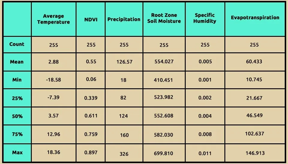
The function data.describe() in Pandas is a powerful tool for understanding the distribution of data within a DataFrame. Here's an explanation using some of the information based on the search results: Using data.describe(), it provides a comprehensive summary of the statistical properties of the numerical columns in your dataset. This function computes several key metrics that help in understanding the distribution and characteristics of the data, including:
Count: This indicates the number of non-null entries in each column, helping to identify missing values.
Mean: The average value of the data points, which gives an idea of the central tendency.
Standard Deviation (std): This measures the amount of variation or dispersion in the dataset. A low standard deviation indicates that the values tend to be close to the mean, while a high standard deviation indicates more spread-out values.
Minimum (min): The smallest value in each column, providing insight into the lower bounds of your data.
25th percentile(25%): Also known as the first quartile, this value indicates that 25% of the data points fall below this threshold.
Median (50%): The middle value when all entries are sorted, which divides the dataset into two equal halves and is a robust measure of central tendency.
75th Percentile (75%): the third quartile, indicating that 75% of the data points are below this value.
Maximum (max): The largest value in each column, showing the upper bounds of your data.
These statistics help you take a closer and quick view at the central tendency, variability and outliers present in your data. As an example, when the mean is much higher than the median, it may indicate that there are many high outliers giving a right-skewed distribution. These statistics can also help to make decisions about additional data analysis or preprocessing steps required in machine learning tasks.
Overall, data.describe() serves as an essential first step in exploratory data analysis (EDA), enabling you to gain insights into your dataset’s structure and distribution before proceeding with more complex analyses or modeling tasks123. This explanation highlights how data.describe() is utilized to understand data distribution effectively and its significance in data analysis workflows.
data.describe()
Table 2. Statistical summary of dataset numerical features, showing mean, min, max, and quartiles.
5. Converting Categorical Column to Numerical
Many machine learning algorithms, including linear regression, logistic regression, and support vector machines, require numerical input features. In order for these algorithms to work and process these types of data in must be transformed in a numerical way. Using LabelEncoder to map categorical column to numerical column is on of the very important pre-procesing step that can be employed in many machine learing tasks. It allows algorithms to work efficiently with non-numeric data, allowing for better model training and evaluation. It is very important to know when and how to apply different encoding techniques that will help the machine learning workflow.
By using this method, we convert the month to a numerical column.
6. Standardization
The standardscaler from the sklearn.preprocessing module is a popular method for standardizing features by removing the mean and scaling to unit variance. Based on the search results, here are the main points about its function, usage, and significance. The standardscaler standardizes features of your dataset for mean 0 and stdev1. This is important as many machine learning algorithms are sensitive to the scale of input data. StandardScaler can be used in cases, when: Your dataset has features that differ a lot in scale.
You are using algorithms that rely on distance calculations (e.g., K-nearest neighbors, support vector machines) or gradient descent optimization (e.g., linear regression).
The code snippets x = data.iloc[:, :-1] and y = data.iloc[:, -1] are often used in the context of preparing features and target variables for machine learning models. Here’s a deep-dive of what each line is doing:
.iloc[ ] is a Pandas method used for integer-location-based indexing. It allows you to select rows and columns by their integer positions. And indicates that you want to select all rows. -1 This slice notation means ‘select all columns except the last one.’ In this case, it extracts all feature columns from the DataFrame, which are typically used as input variables for machine learning models. As a result, x will contain all the features (input variables) from the dataset, excluding the last column.
In Y data.iloc[: -1] -1 refers to the last column of the DataFrame. This line selects all rows from only the last column of the dataset. These lines of code efficiently separate your dataset into input features (X) and output feature(y). This separation is essential for building predictive models and conducting further analysis in machine learning workflows.
X = data.iloc[:, :-1]y = data.iloc[:, -1]y
Table 3. The amount of evapotranspiration in the study area
No.
Evapotranspiration
0
0.092120
1
0.789177
2
1.510688
3
1.746900
4
1.393191
...
...
220
1.075543
221
0.243264
222
-0.740914
223
-0.921438
224
-1.031791
225 rows × 1 columns
dtype: float64
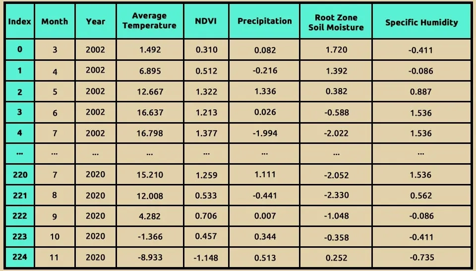
X
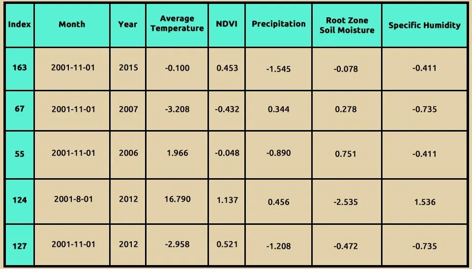
Table 4. Monthly climatic features (2002–2020) used as predictors for Evapotranspiration.
8. Indicates Relationships Between Each Feature
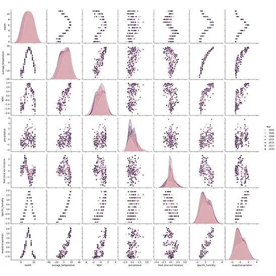
Seaborn is a powerful visualization library based on Matplotlib that provides a high-level interface for drawing attractive statistical graphics. It simplifies the creation of complex visualizations. Matplotlib is a widely used plotting library in Python for creating static, animated, and interactive visualizations.
sns.pairplot() function creates a grid of scatter plots for each pair of numerical features in the DataFrame. It allows you to visualize the relationships between multiple variables simultaneously. diag_kind = “kde” argument specifies what kind of plot to display on the diagonal (where each variable is plotted against itself). Setting diag_kind to “kde” means that kernel density estimation (KDE) plots will be used, which provides a smooth estimate of the distribution of each variable.
hue = “Year ” argument adds color coding to the plots based on the values in the “Year” column. Each unique value in this column will be represented by a different color, allowing you to see how data points are distributed across different years.
Purpose and Benefits of Using pairplot allows you to quickly assess relationships between pairs of features in your dataset. For instance, you can observe how average temperature relates to precipitation or how NDVI varies with evapotranspiration. By coloring points according to the “Year”, you can identify trends over time or see if certain years exhibit distinct patterns in feature relationships. The scatter plots can help you visually identify any outliers or unusual observations that may require further investigation. The KDE plots on the diagonal provide insights into the distribution of each individual feature, helping you understand their behavior (e.g., normality, skewness). This code snippet effectively utilizes Seaborn’s pair plot functionality to create an informative visualization that helps explore relationships between multiple variables within your dataset. It is an excellent tool for exploratory data analysis (EDA), allowing for quick insights into data patterns and distributions.
import seaborn as sns
import matplotlib.pyplot as plt
sns.pairplot(data, diag_kind="kde",hue="Year" )
plt.show()
Fig. 3. Visual assessment of feature correlations and individual distributions using a Seaborn pair plot.
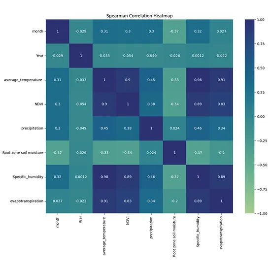
9. Correlation Analysis
Calculating the Spearman Correlation Matrix: This method computes the correlation matrix for the DataFrame data using Spearman's rank correlation coefficient. Spearman correlation assesses how well the relationship between two variables can be described by a monotonic function. It is particularly useful when the data does not meet the assumptions of normality required for Pearson correlation.
import seaborn as sns
import matplotlib.pyplot as plt
from scipy import stats
corr_matrix = data.corr(method='spearman')
plt.figure(figsize=(12, 10))
sns.heatmap(corr_matrix, annot=True, cmap="crest", vmin=-1, vmax=1, center=0)
plt.title('Spearman Correlation Heatmap')
plt.show()
print(corr_matrix)
plt.figure(figsize=(12, 10)): This line sets the size of the figure to 12 inches wide and 10 inches tall.
sns.heatmap(): This function creates a heatmap from the correlation matrix.
corr_matrix: The data to be visualized, which contains correlation coefficients.
annot=True: This argument adds the numerical values of the correlations directly onto the heatmap cells.
cmap="crest": This specifies the color map to be used for coloring the heatmap. "crest" is a diverging color palette that can effectively represent both positive and negative correlations.
vmin=-1, vmax=1: These parameters set the limits for the color scale, ensuring that it spans from -1 (perfect negative correlation) to +1 (perfect positive correlation).
center=0: This centers the colormap at zero, making it easier to distinguish between positive and negative correlations.
Fig. 4. Correlation Heatmap visualizing the strength of relationships among Evapotranspiration and input data.
10. Determine Train and Test Set
The train_test_split function is imported to divide array ar matrices into random training and testing subsets. This process is crucial for assessing the performance of machine learning models.
test_size = 0.2: This parameter specifies the proportion of the dataset to include in the test split. In this case, 20% of the data will be used for testing, while 80% will be used for training. You can also specify this as an integer (number of samples) instead of a fraction.
random_state = 42: This parameter sets a seed for the random number generator used to shuffle the data before splitting. By setting a specific value (in this case, 42), you ensure that the results are reproducible; every time you run this code with the same dataset and parameters, you will get the same split.
from sklearn.model_selection import train_test_split
X_train, X_test, y_train, y_test = train_test_split(X, y, test_size=0.2, random_state=42)
Output Variables:
X_train: The feature set for training.
X_test: The feature set for testing.
y_train: The target variable for training.
y_test: The target variable for testing.
Using the .shape command, we can see the number of X_train
X_train.shape
(180, 7)
X_train.head()
Table 5. Training dataset sample (X_train) showing standardized climate variables for LightGBM.
11. Import LightGBM Model
The combination of these libraries forms a robust framework for conducting data analysis and building machine learning models in Python. This framework is widely used due to its efficacy and the extensive functionalities it provides to data scientists and analysts.
Import the LGBMRegressor class from the LightGBM library. The LGBMRegressor is exclusively designed for regression tasks. The parameter verbose=-1 is set to suppress output messages during training. This can be useful when you want to reduce console clutter, especially in larger training processes.
from lightgbm import LGBMRegressor
lgbm =LGBMRegressor(verbose=-1)
lgbm.fit(X_train, y_train)
12. Metrics Evaluation
In this current research study, the performance of the LightGBM model was estimated by the following statistical indicators: RMSE, MSE, MAE, and Coefficient of Determination expressed as R². These measures have earlier been applied in calculating data fitting precision and the predictions made by a model.
Root Mean Squared Error (RMSE): RMSE calculates the square root of the average of the squared differences between predicted and observed values. This metric provides a comprehensive measure of model error, emphasizing larger discrepancies due to squaring the differences. A lower RMSE indicates better predictive accuracy (Timothy O and Hodson, 2022).
Mean Squared Error (MSE): MSE simply computes the average of squared differences between predicted versus actual values. Since it squares these differences, the bigger an error is, the more prominence the MSE will give to such an error over smaller errors. This characteristic makes MSE particularly useful in identifying models that consistently overestimate or underestimate a series of values (Poonam Sharma et al., 2024).
Mean Absolute Error (MAE): It is a calculation that finds the average of the absolute differences between forecast and actual values. Unlike RMSE and MSE, which square the errors, MAE gives an interpretation about the average magnitude of the error provided. According to Timothy O and Hodson 2022, it is less sensitive to outliers; hence, it is robust in measuring the accuracy of prediction (Timothy O and Hodson2022).
Coefficient of Determination (R²): R² describes the proportion of variance in the dependent variable explained by independent variables in the model. It is a measure of goodness of fit of the model to data; the closer the R² value is to 1, the better the fit, while values closer to 0 indicate that the model explains little or no variance (Shabnam Sadri Moghaddam and Hassan Mesghali2023).
Root Mean Squared Error (RMSE): 0.6123724356957945
13. Scatter Plots
Scatter plots are essential tools for visualizing the relationship between two numeric variables, allowing researchers to identify correlations and trends (Bergstromand and West, 2024).
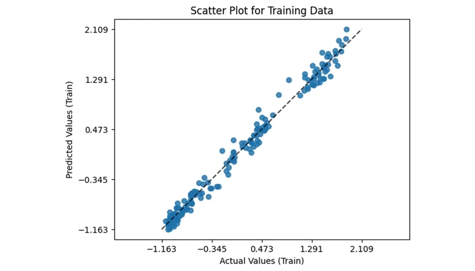
13.1. Train Set
The provided code snippet demonstrates how to visualize prediction errors using the PredictionErrorDisplay class from the sklearn.metrics module. This visualization helps assess the performance of a regression, particularly by comparing actual versus predicted values. Here’s a breakdown of the code and its components. The estimator method is called on the PredictionErrorDisplay class.
lgbm: The trained LightGBM model used for predictions.
X_train: The feature set from the training data.
y_train: The actual target values from the training data.
kind=”actual_vs_predicted”: Specific that the plot should display actual values against predicted values.
ax=ax: Specifies which axes to plot on.
If the model performs well, points will cluster around a diagonal line (where predicted values equal actual values). Deviations from this line indicate prediction errors, which can help identify areas where the model may need improvement. Using PredictionErrorDIsplay is an effective way to visualize and interpret the performance of a regression model in Python. By plotting actual versus predicted values, you can gain insights into your model’s accuracy and identify potential issues that may require further tuning or adjustment.
from sklearn.metrics import PredictionErrorDisplay
fig, ax = plt.subplots()
PredictionErrorDisplay.from_estimator(
    lgbm,
    X_train,
    y_train,
    kind="actual_vs_predicted",
    ax=ax
)
ax.set_xlabel('Actual Values (Train)')
ax.set_ylabel('Predicted Values (Train)')
ax.set_title('Scatter Plot for Training Data')
Fig. 5. LightGBM model fit: Actual vs. Predicted Evapotranspiration values on the training data.
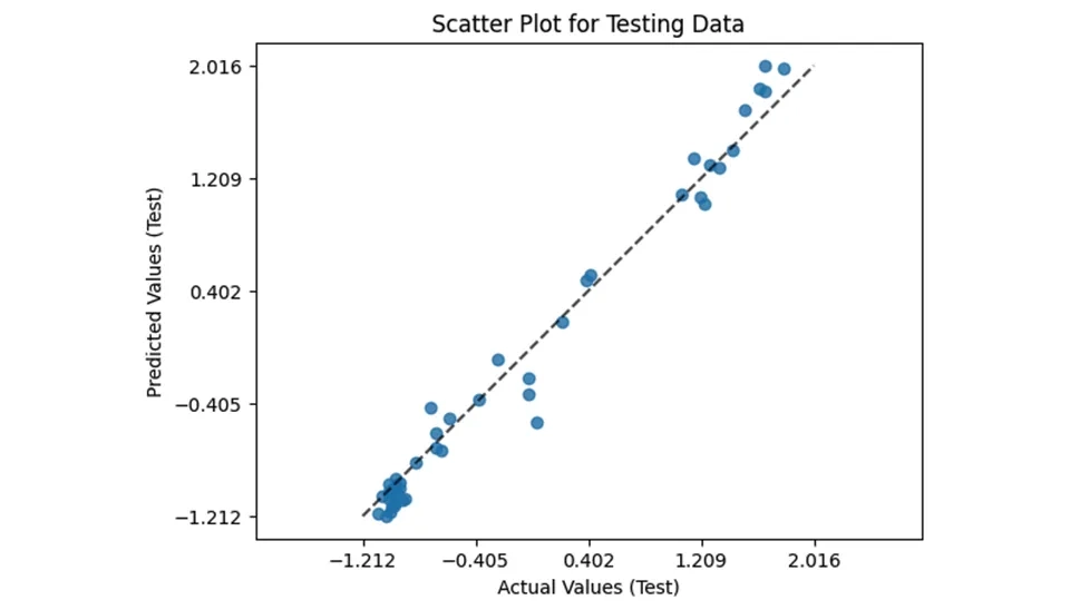
13.2. Test Set
As mentioned in the previous section , in the test section, we will have the same parameters for drawing the grid as the train section. To evaluate the performance of the model on unseen data, the same approach is applied to the test set using the PredictionErrorDisplay class form sklearn_metrics. This visualization plots actual versus predicted values for the test data, offering insight into the model’s generalization capabilities. Here’s a breakdown of the key components:
The scatter plot highlights the model’s predictive accuracy on new data. Ideally, the points should cluster around the diagonal line, indicating that predicted values match actual values. Larger deviations suggest areas where the model may not perform as well. This visualization provides critical insights into the model’s behavior on test data, helping to validate its robustness and identify any overfitting or underfitting issues. By systematically analyzing prediction errors on both the training and test sets, this approach ensures a comprehensive assessment of the model’s performance.
Fig. 6. LightGBM model fit: Actual vs. Predicted Evapotranspiration values on the test data
14. Interpretation using SHAP in Evapotranspiration Modeling with Light GBM
When using machine learning techniques in decision-making processes, the interpretability of the models is important. In decision-making, it is important to recognize why decisions are made. Although complex machine learning models such as deep learning and ensemble models can achieve high accuracy, they are more difficult to interpret than simple models such as a linear model. To provide interpretability, tree ensemble machine learning algorithms such as the Random Forest and Gradient Boosting Decision Tree (GBDT) (Nohara et al., 2022) can provide feature importance, which is each feature’s contribution to the outcome. However, Lundberg et al. pointed out that popular feature importance values such as gain are inconsistent (Lundberg and Lee, 2017). For addressing these problems, Lundberg et al. proposed using the SHapley Additive exPlanation (SHAP). Using the idea of the Shapley value, which is a fair profit allocation among many stakeholders depending on their contribution, SHAP represents the outcome as the sum of each feature contribution calculated as the Shapley value. SHAP values have proved to be consistent and SHAP summary plots provide a useful overview of the model (Nohara et al., 2022). SHAP works in the following steps: (i) SHAP assigns a value to each input feature of the model’s prediction; (ii) employing game theory, it attributes credit for the model’s prediction to each feature or feature value; (iii) SHAP calculates the Shapley values for each feature of the sample to be interpreted, where each Shapley value represents the impact that the feature to which it is associated generates in the prediction.
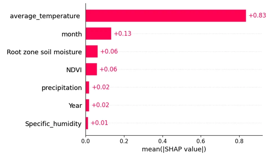
Regarding Fig. 6, the y-axis of the plots indicates the feature importance, with higher values representing more important features. As shown, average temperature was the most important feature. And after that, the parameters average temperature and month are among the effective parameters in increasing the amount of evapotranspiration.
This line uses the plot.subplots() function from the matplotlib library to create a new fig and a single set of axes; the fig object serves as a container for all plot elements, and the axis is where the actual plotting occurs.
This line generates a bar plot using the SHAP library's shap.plots.bar() function. The explanation parameter contains SHAP values that represent feature importance for a model's predictions. The max_display parameter limits the number of features shown in the plot to the number of columns in X_train, ensuring that only relevant features are visualized. The ax=ax argument specifies that the plot should be drawn on the previously created axes (ax), allowing for organized visualization within the same figure. Setting show=False prevents immediate display of the plot, enabling further customization before rendering it.
Fig. 7. SHAP bar plot showing feature importance for Evapotranspiration prediction by the LightGBM.
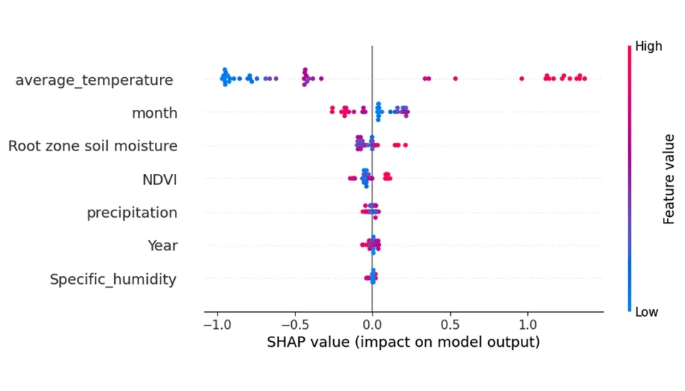
Regarding Fig. 7, the x-axis represents the feature effects, showing the impact of each feature on the model's output. The color of the points in the plots represents the value of the feature; red points indicate features that increase the predicted values, while blue points represent characteristics that decrease the predicted values. As shown, temperature and average_temperature in the digester are operating parameters that show an important effect on evapotranspiration. If moving from left to right, the transition from red to blue indicates that the feature (temperature) is inversely related to the biogas production rate and conversely.
Fig. 8. SHAP beeswarm plot showing how feature values influence the Light GBM output.
16. Conclusion
This study underscores the essential function of evaporation and transpiration, collectively known as evapotranspiration, in agricultural water management and environmental dynamics and highlights the transformative potential of machine learning, particularly the Light Gradient Boosting Machine (LightGBM), for predicting these processes. By leveraging techniques like Gradient_based One_side Samoing (GOSS) and Exclusive Feature Bundling (EFB), LightGBM excels in handling large_scale, high_dimentional datasets, delivering both speed and accuracy. Utilizing a comprehensive dataset with key meteorological and environmental features, such as temperature, NDVI, precipitation, evaporation, soil moisture, and specific humidity, this study offers insights into seasonal and interannual variability critical for sustainable water resource management. Advanced tools like Numpy, Pandas, Matplotlib, and Scikit-learn ensure robust preprocessing and evaluation, with methods such as train_test_split and LabelEncoder enhancing model reliability and performance assessment The findings emphasize the importance of machine learning in understanding and managing evapotranspiration, providing actionable insights for sustainable resource management and climate efforts.
Evapotranspiration Prediction Using Light GBM Model: A Comprehensive Guide | Waterlyst


Comments
No comments yet
Be the first to comment
Share your thoughts and start the conversation.